The story
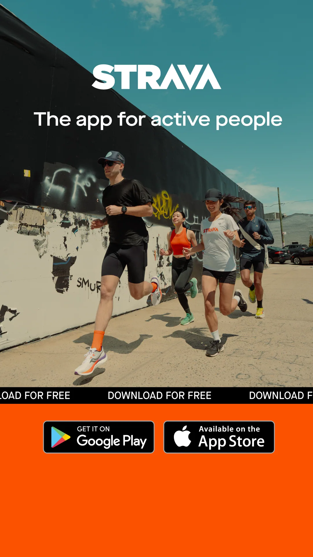
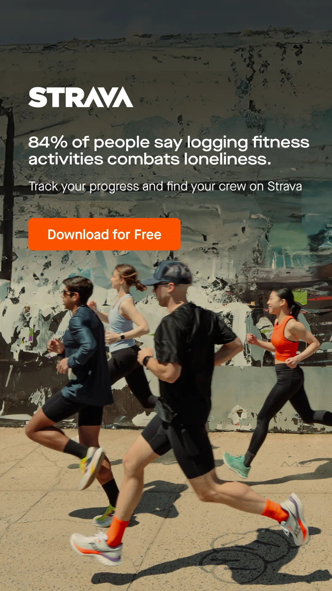
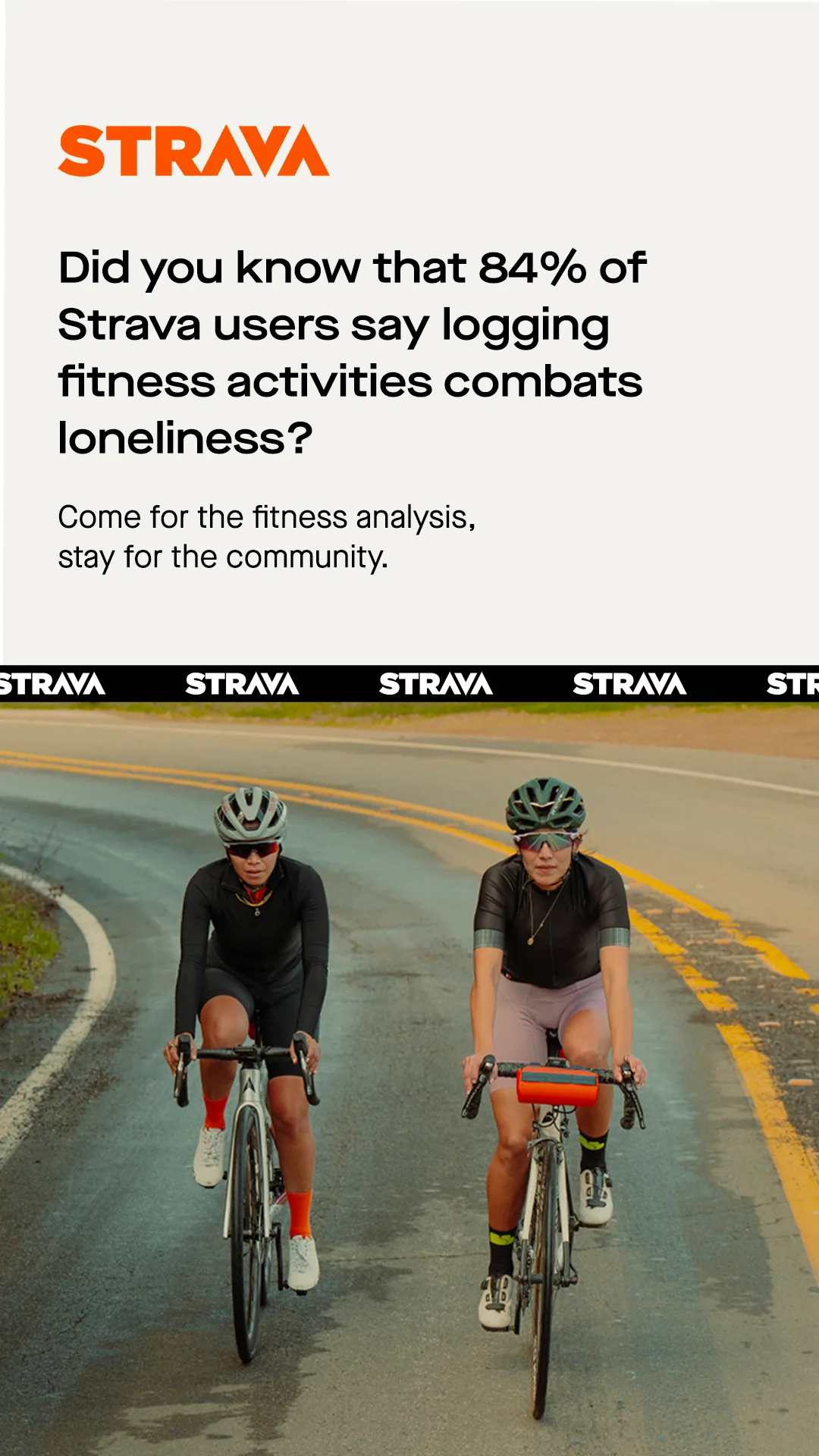
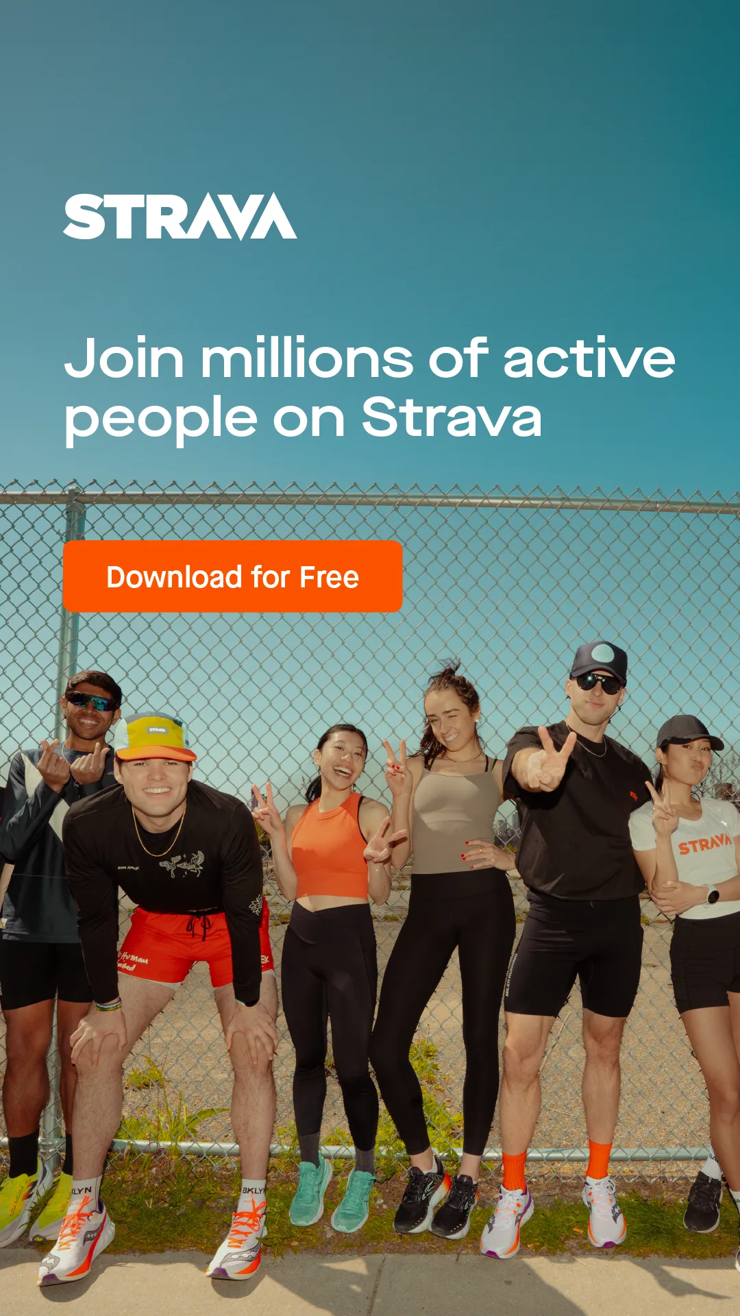
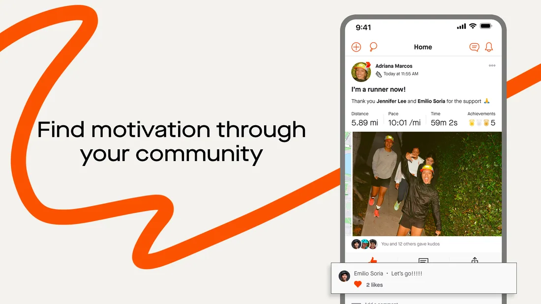
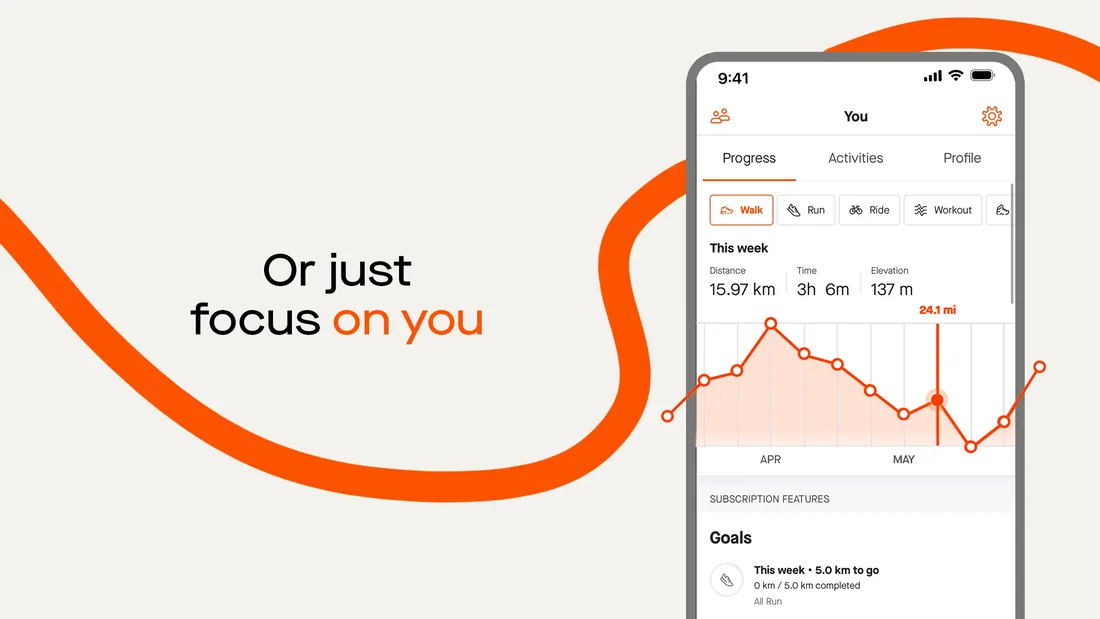
Creative that felt like using the app, not a banner ad for a fitness product.
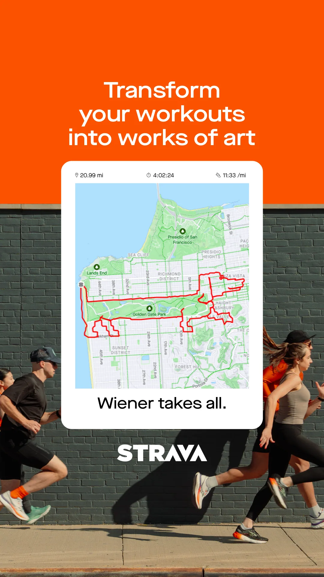
The polyline was the answer. That connected-route line is the most distinctively Strava thing in the whole product, and it was being underused. We put it at the centre of the visual language as the symbol of what the app rewards: going somewhere.
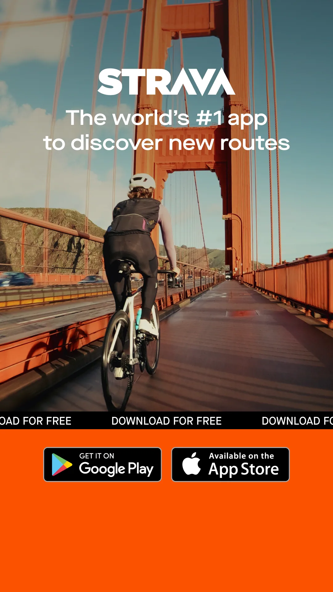
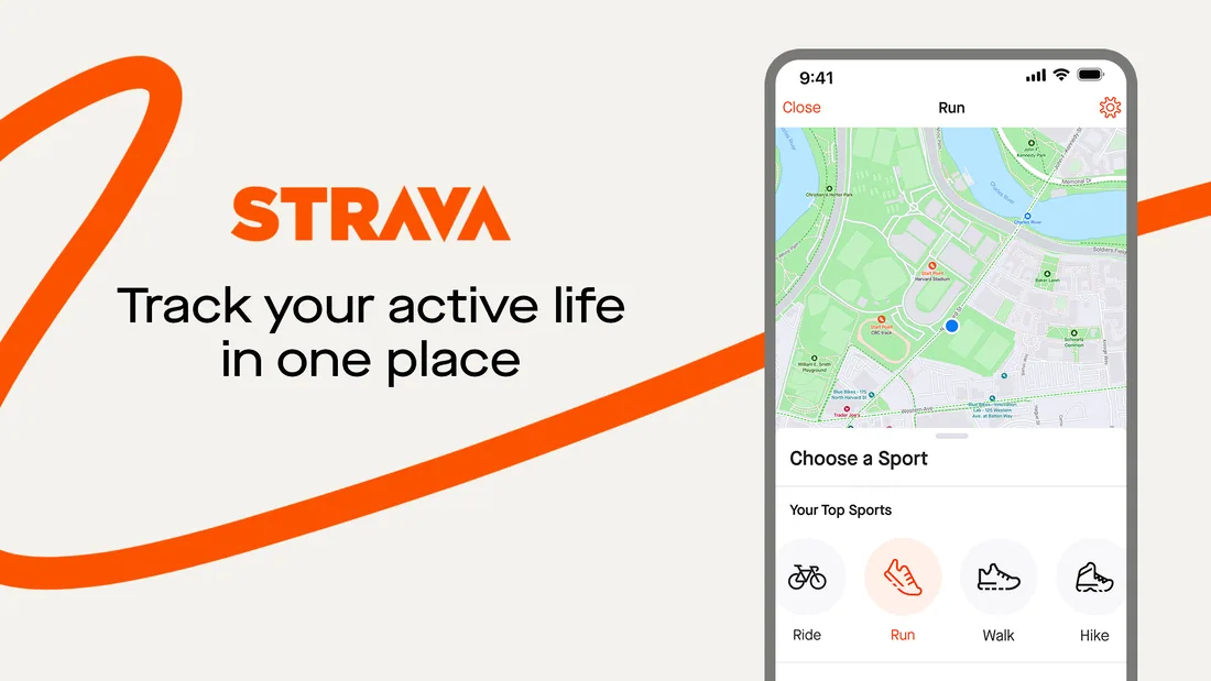
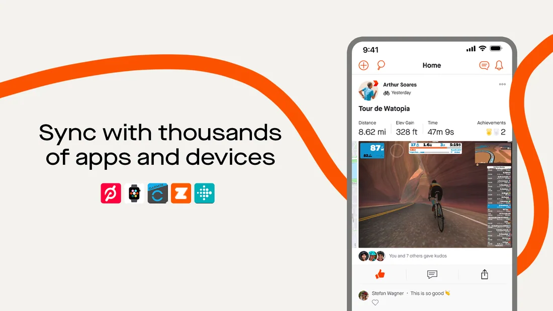
Upper funnel ran on energy and colour: high contrast, fast-cut motion, built to stop a scroll. Lower funnel kept the same system and sharpened the message around the trial. The aim was creative that felt like using the app, not a banner ad for a fitness product.
+52% app installs across Apple and Google Play.
+34% new user registrations.